


Mobile First, Not Mobile Only: Why Your Business Needs Both
Let’s be honest the debate around mobile versus desktop design has been going on for years. Every time there’s a beautifully designed website that completely falls apart on mobile, or worse, a mobile-only experience that strips away all the functionality that makes a product actually useful, it deserves a conversation. So here we are.
The digital landscape has completely transformed, and if you’re still debating whether to prioritize mobile or desktop, you’re already behind. But here’s the thing: the conversation shouldn’t be mobile versus desktop. It should be about understanding what each platform does best and designing accordingly.
The Numbers Don't Lie (But They Don't Tell The Whole Story Either)
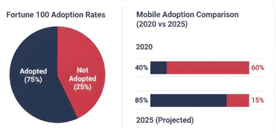
Let’s start with some context. According to recent industry data, nearly two-thirds—that’s 62 percent—of Fortune 100 companies now have publicly available mobile apps, while 52 percent maintain a mobile specification website. These aren’t small businesses testing the waters; these are industry giants who’ve invested millions into understanding tech trends and user behavior.
But here’s what those statistics don’t show: those same companies aren’t abandoning their desktop experiences. Why? Because they understand something crucial that every business needs to understand too.
Why Mobile First Matters (But Not Mobile Only)
Look, everyone has a smartphone glued to their hand these days. Our attention spans are shrinking we want everything instantly, right at our fingertips. People navigate entire shopping experiences, book vacations, and even apply for jobs on their phones while waiting in line for coffee. The convenience is undeniable.
Mobile responsive design isn’t just a nice-to-have anymore; it’s the foundation. When approaching a project, starting with mobile makes sense because that’s where most users will first encounter your brand. It forces prioritization, really makes you think about what matters most, and strips away the unnecessary clutter.
[SUGGESTED IMAGE HERE: Side-by-side comparison of a cluttered desktop interface versus a clean, focused mobile interface showcasing the same content]
But and this is a big but mobile first doesn’t mean mobile only, and here’s why this distinction matters so much.
The Desktop Advantage in Mobile First Design
When someone’s seriously researching a product, comparing options, or trying to understand something complex, where do they go? Experience shows they go to their desktop. Not because mobile can’t handle it, but because the desktop environment offers something fundamentally different: space to think, to compare, to really dive deep.
Think about typical user behavior. When casually browsing, people are on their phones. But when they need to fill out a detailed form, compare specifications across five different products, or really study something they switch to their laptop or desktop. This pattern is consistent across industries.
This is especially true for commercial applications and business tech solutions. At CDD Software and Support, we’ve seen this pattern repeatedly with clients. Users discover their services on mobile during commutes or lunch breaks, but when it comes time to actually engage with complex features or make purchasing decisions, they’re on desktop where they can see more, do more, and process information more effectively.
What Great Mobile Responsive Design Actually Looks Like
Here’s where web designer responsibilities get really interesting. It’s not about creating two separate experiences or choosing one over the other. It’s about crafting a responsive web design that intelligently adapts to context.
Mobile First Design Priorities
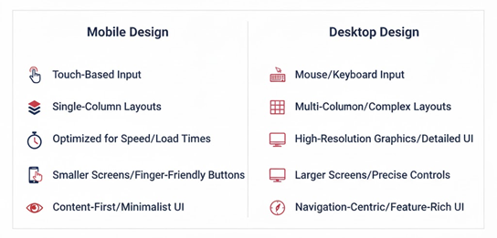
For mobile users, the focus should be on:
- Lightning-fast load times (because nobody’s waiting around)
- Touch-friendly interfaces that actually work with human thumbs
- Simplified navigation that doesn’t make people hunt for what they need
- Information revealed progressively, so users aren’t overwhelmed
Enhancing Mobile First for Desktop
For desktop users, enhancement includes:
- Rich, detailed content that takes advantage of all that screen real estate
- Advanced functionality that would feel cramped on mobile
- Multi-column layouts that let users see relationships between information
- Keyboard shortcuts and interactions that power users love
Mobile vs Desktop: Design Considerations
The magic happens when these experiences feel native to their platform while maintaining brand consistency. That’s the art of modern UI UX design.
How We Approach Mobile First Strategy
At CDT Software and Support, the entire development philosophy is built around this balanced approach. When clients come wanting a mobile specification website or a complete digital overhaul, the question isn’t just “mobile or desktop?” The question is “What is your user trying to accomplish, and where are they when they’re trying to do it?”
This mindset has helped deliver web design solutions that actually work in the real world, not just in design mockups. Conversion rates improve dramatically when users aren’t forced to accomplish desktop-level tasks on mobile screens, or when desktop users aren’t given a blown-up version of a mobile site that wastes 60% of their screen space.
Understanding Mobile First in Current Tech Trends
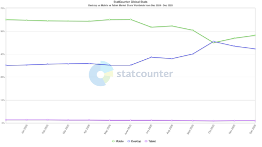
Yes, mobile usage dominates the statistics. Yes, tech trends show continued growth in mobile-first behaviors. But successful digital strategies recognize that different devices serve different purposes in your customer’s journey.
The informational phase? That’s often mobile someone’s scrolling, discovering, getting first impressions. The navigational phase? Could be either, depending on context. The commercial phase where decisions happen and transactions complete? That often benefits from desktop’s expanded capabilities.
Understanding this progression is what separates good design from great design.
Frequently Asked Questions (FAQ)
Absolutely not! Mobile first means starting your design process with mobile constraints, which forces prioritization of what’s truly important. But the experience should absolutely be enhanced for desktop users who have more screen space and different interaction patterns. Think of it as building a solid foundation (mobile) and then adding thoughtful expansions (desktop enhancements).
Great question! While 70% of traffic might be mobile, look deeper at conversion data. Often, desktop users convert at higher rates or have higher average order values because they’re in a different mindset more focused, more ready to commit. Also, that 30% desktop traffic might represent the most valuable customers. Don’t leave money on the table by neglecting them.
The biggest mistake? Treating mobile design like a simplified version of desktop rather than designing specifically for mobile behavior. Mobile users aren’t just desktop users on smaller screens—they’re in different contexts, with different goals, different attention spans, and different interaction patterns. Design for their reality, not a scaled-down version of desktop reality.
Test it on real devices (not just browser emulators), but more importantly, look at the data. Check bounce rates by device, time on site by device, and conversion rates by device. If mobile users are bouncing quickly or not converting, the mobile responsive design probably isn’t as effective as it could be. Also, try accomplishing the site’s primary goals on your phone if it’s frustrating, it’s frustrating for users.
It depends on the specific use case. Apps make sense when users need to access services frequently, when device-specific features are needed (like camera or location), or when offline functionality is important. But apps require significant ongoing investment. For many businesses, a well-executed responsive web design covers 90% of needs. At CDD Software and Support, we help clients evaluate whether an app investment makes sense based on their specific goals and user needs.
The Bottom Line: Balance Is Everything in Mobile First Design
The reality is clear: both extremes fail. Beautiful desktop sites that are completely unusable on mobile lose customers before they even have a chance to engage. And mobile-only experiences frustrate desktop users so much they go to competitors.
The answer isn’t choosing sides. It’s understanding that mobile first is a design philosophy, not a device discrimination policy. Start with mobile because it forces discipline and prioritization. But honor desktop users by giving them the enhanced experience their context deserves.
In 2026 and beyond, the winners won’t be the companies who went “all in” on mobile or stubbornly stuck with desktop-centric design. The winners will be those who understood that business tech success comes from meeting users where they are, on whatever device they happen to be using, with experiences optimized for that specific context.
That’s not just good web design. That’s respecting users enough to design for their reality, not assumptions.
And honestly? That’s what makes this work so exciting and impactful.